The Media Coverage Of Ian Has Been Frustrating
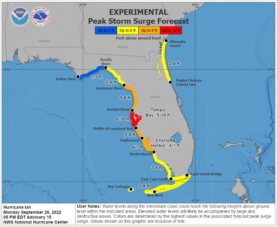
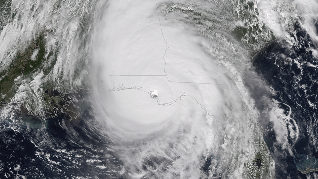
Hurricane Ian was the rare hurricane that maximized it’s surge, wind, and inland flooding potential. The result was a human tragedy in southwest Florida. The death toll climbed over 100 today, as criticism and questions fly about evacuation decisions and “misses” in the forecast.
As someone who understands the forecasts, the public and media misunderstanding of the forecast has been frustrating. The public misunderstanding is an “us” problem, and one meteorology as a field has struggled to solved.
I saw an Axios article this morning discussing the difficulty of the forecast and messaging challenge for meteorologists ahead of a storm like this. It started great, with the overall points to start the discussion relevant. Though I did take some issue with the initial model discussion.
Why it matters: With the death toll mounting, meteorologists, emergency managers and others are asking how they could have done a better job making clear the storm would devastate the Ft. Myers area — and what lessons they can learn for the next storm.
The story of how Ian surprised so many Floridians with its southerly shift is about far more than a computer model inferiority complex.
It involves how we each perceive and process risk information about novel threats, as well as understand the storm graphics seen on television and online.
https://www.axios.com/2022/10/03/hurricane-ian-forecast-caught-off-guard
These are all relevant questions, and ones that anyone in the weather enterprise should ask after a major event. My issue is the article draws some bad conclusions, despite the good opening.
I think it would be a good exercise to both examine where the article runs amok but also how to better communicate threats and give good answers to the questions posed.
Any quotes below are from the Axios article linked twice above, unless otherwise noted.
Models Struggled Yes, But This Isn’t “Modelology”

The big picture: Several factors combined to make Hurricane Ian the most complex domestic hurricane forecast in years.
Computer models used to help predict the weather were at war with one another until about 36 hours before landfall, an unusually short window of time to convince coastal residents to evacuate.
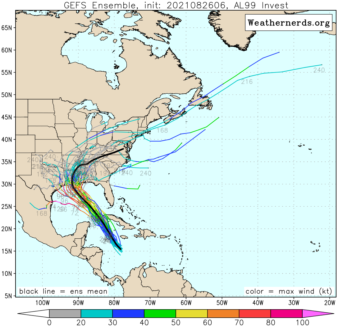
Notably, the main American forecast model, known as the Global Forecast System (GFS), insisted for days that the storm would strike the Florida Panhandle or Big Bend area as a Category 2 storm.
At the same time, the European model, run using faster supercomputers, consistently signaled a more southerly and stronger storm track for Florida. It rarely wavered, and ended up far closer to the actual outcome.
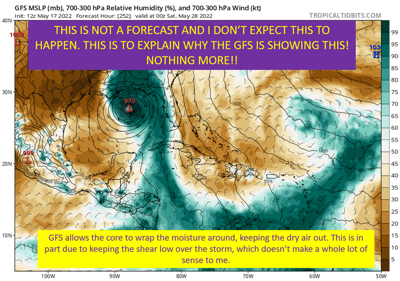
So yeah, there was considerable model spread. This was the most difficult and frustrating forecast since Sally in 2020. The GFS was consistently too far west, for reasons I covered extensively. It was a combo of it’s biases (too quick with troughs) and how it handles convection in developing storms (too fast to spin up new areas or rotation).
All that said, it was asking a couple of good questions. Downshear reformation happened to some extent, though not nearly to what the GFS was showing. It was a good reminder for a west bias in the run through the Central Caribbean due to the shear. The meteorologist watching it has to know these biases of the GFS, realize it has a good idea but is overdoing it.
I find this discussion about the models so early in the Axios piece worrying. There really shouldn’t be decision makers outside of those with a meteorological background utilizing these models. This spread made the official forecast have more movement than usual (landfall region was always in the cone though) but again, mostly an issue for the folks at the NHC trying to put together the forecast.
Oh, and the European Didn’t “Nail” Ian. Despite the Article’s Assertion.
I’ve seen a lot of discussion about how the Euro did so great with Ian, but I honestly found it lacking a lot of the time. Additionally, the reason it ended up more right early was because it was wrong about Ian’s strength. I will say though, it’s bias in keeping the synoptic flow a little slower than the GFS did end up letting it see Ian would get the NE turn.

The Euro kept Ian too weak into the western Caribbean. This meant that, on the European model, Ian didn’t have enough outflow to nudge this feature out of the way. This allowed for the upper low to tug Ian more due North far too early, and take a path way too east over the heart of Cuba. Which allowed Ian to be faster and closer to the trough that would turn him NW.
That isn’t “getting it right” as much as having something in the early steps wrong ending up getting the right landfall for the wrong reasons.
Yes, it did better than the GFS. Nope, that doesn’t mean it was “right”.
It’s The Media’s Job to Translate The Forecast For The Public
Zoom in: In media reports, survivors of the storm in Lee County, Fla., which includes hard hit Ft. Myers Beach and Sanibel Island, have said they thought the core of the hurricane was headed for Tampa, based on previous forecasts.
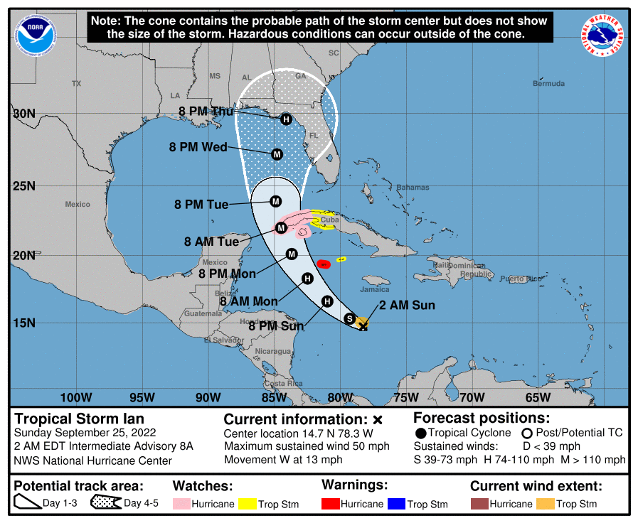
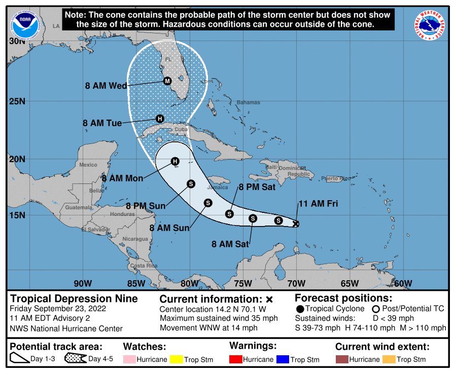
But the National Hurricane Center (NHC) split the difference between modeling guidance in its track forecasts, and consistently emphasized the uncertainty and the need to focus on more than the centerline in its “cone of uncertainty“ plots.
For example, NHC forecasters cautioned at 5am Tuesday morning: “Users are reminded to not focus on the exact track as some additional adjustments to the track are possible, and wind, storm surge, and rainfall hazards will extend far from the center.”
The Hurricane Center was all like “Hey guys, don’t focus too much on the centerline. This is both uncertain and will bring impacts far from the center”.
Portions of the public: “Y’all said it would hit Tampa”
Hell, the Governor of Florida got in on the misunderstanding.
Even so, DeSantis pointed to the ample public warnings early this week that Ian posed a catastrophic danger to the flood-prone Tampa Bay region, which had not taken a direct hit from a major hurricane in more than a century.
“When we went to bed Monday night, people were saying this is a direct hit on Tampa Bay — worst case scenario for the state,” DeSantis said during a news briefing in Fort Myers on Saturday.
https://www.politico.com/news/2022/10/01/florida-death-toll-hurricane-ian-00059893

So what happened? I see Fort Myers is still very much in the cone, and at under 48 hours till landfall, should have been preparing for a major hit. Since it was going north of them, it was still going to bring significant surge, though that track would not have been as devastating. So why did so many people expect this to be mostly a Tampa problem?
I mean, it was clear there would impacts there regardless. Also, we’ve seen a Tampa bound storm turn early and crush this region some 18 years ago with Hurricane Charley.
And I’m not saying this as a direct criticism. Just that I genuinely don’t understand what the disconnect was here. I know the meteorologist on the local news weren’t telling people to take their guard down, so it boggles the mind that after all of Tuesday focusing on Ft. Myers that people didn’t know it was coming.
So Few Understand What The Cone Actually Tells You
Between the lines: Studies have shown that the 20-year-old “cone of uncertainty” graphic is often misunderstood.
If you are in the cone, there is a two-thirds likelihood that you will see a direct hit from a landfalling storm. But it does not mean that areas outside the cone will be unscathed.
“If you are in that, you are two-thirds likely to get the landfall. That’s a pretty high likelihood of something very bad happening,” said Brian McNoldy, a meteorologist at the University of Miami, in an interview.
He said that the actual landfall location never left the cone of uncertainty in the five days prior to landfall.
The width of the cone of based on one standard deviation (66%) of the track errors out to a certain time (width at 24 hours is 66% of the error of the last five years at 24 hours) based on the errors over the past five years.
It’s statistical. It tells you nothing of the actual uncertainty.
The track is also based on the center of the storm. Obviously there will be impacts well outside of that center. Each storm is different, and will have different levels of impact based on trajectory and size. Yet everyone focuses on that center line more than ANYTHING else. It’s a very useful tool, if you use it right. If not, it can mean letting your guard down despite it telling you to do the opposite.
Emphasis On Impacts vs Track

What they’re saying: Alberto Cairo, a journalism professor at the University of Miami who studies storm communication, recommends that journalists emphasize hurricane threats and impacts maps instead of the cone.
“What areas may experience a storm surge? What areas may experience strong winds?” Cairo said in an interview. “Those types of graphics exist, and the National Hurricane Center is actually making an effort to push those graphics [rather than] the cone.”
This is a good point.
I’ve watched people watch hurricanes online for years. I’ve lived on the Gulf Coast for all of those years and I’ve watched the TV news when storms are coming. There has historically been and, certainly in the case of the internet, currently is way too much of a focus on exact landfall points. People want to know where a model puts a hurricane.
There’s a disconnect between how those in the weather field view the forecast vs how most of the public does. At least I think so.
A forecast is about narrowing possibilities until you find the right solution, and showing what the most likely solution appears to to be at the time.
The forecast isn’t a line with an uncertainty cloud around it. It is the uncertainty cloud with a middle line drawn in it.
Putting graphics in terms of probabilities gets the public to start thinking about storms in those terms more and more. Which is the way we need the public, and governmental decision makers to be thinking about these forecasts.
The Media Focus On Forecasting “Misses” Doesn’t Help People Understand How Forecasts Work

It was a hard forecast and the center line did move a lot over the final few days of the Florida approach. It was a great forecast for the difficulty at hand, but didn’t get the answer right until the last 30 hours. It can both be an accomplishment to get the forecast that correct with the difficulty, and note it was probably figured out too late for decision makers.
It shouldn’t have been for those in the most impacted region, with NHC hammering the uncertainty and the solutions near Tampa still providing a substantial surge risk. Yet, it was.
The focus on the changing forecast for exact landfall location just re-enforces the bad habits of watching the center line. It doesn’t explain the story of figuring out what wasn’t going to happen until we figured out what would. What it does it let decision makers use the changing centerline to cover for their inaction. It also tells the public this is the right action, to focus on the centerline. It covers for politicians while actively impeding people from learning how to get the information to make the best decisions for their situation.
It turns out, misunderstanding what the forecast graphics are for lead to making bad decisions when that’s the main tool you use.
The discussion needs to concern how local, state, federal government officials use and understand the information they’re given. In addition, media focus on impacts vs landfall location would help people understand the limitations within a forecast.
tl;dr version
I guess the Axios piece wasn’t as bad as I made it seem. My main point of contention is the early focus on models, which require some understanding of their biases and limitations to use properly. In addition, the notion the European was the clear model winner with Ian is way too simple for me. What the article does show is there is a disconnect between operational meteorology making the forecasts and what the public hears.
The media should focus on impacts and probabilities of impacts vs too much of a focus on eventual landfall point. Articles about the storm should emphasize the uncertainty when it exists and even discussion different scenarios and how they would happen. Those in government also shouldn’t focus too closely on the center line, but on preparing for the worst reasonable case in the probability cloud.
There’s a lot to learn on the communications front. I don’t have all the answers. I’m still learning myself. After a storm; however, is the ideal time to take a step back and think. Think about how to forecast better and also to explain the forecast better.


